He's BACK!
One of the best parts of having a shop and a press is getting the opportunity to work with fellow artists and printmakers. Mike Kachanis and I have known each other for many years! We have been in some gallery shows and collaborated on prints in the past. There is an earlier blog from last year about our 1st printing marathon at Spofford Press.
This year was our 2nd week long printing session, fueled by coffee, Radiohead bootlegs and nonstop Instagram posts (Mike is finally on social media via an Instagram account)! Here are some pictures from this past week!

We cut down Mike's paper on day 1. Many pieces of Japanese Mulberry ready for some ink.

The Blocks
Mike tends to make larger woodcuts then his etchings. Printing them is better suited for 2 people, which is how these week long events started!
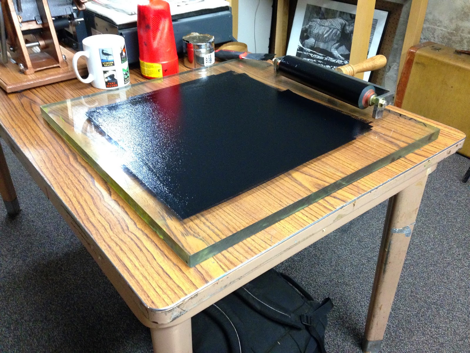
Ink slab. Big boy Brayer.

Mike rolling up the "Toadstool Hollow" block.
Glossy!
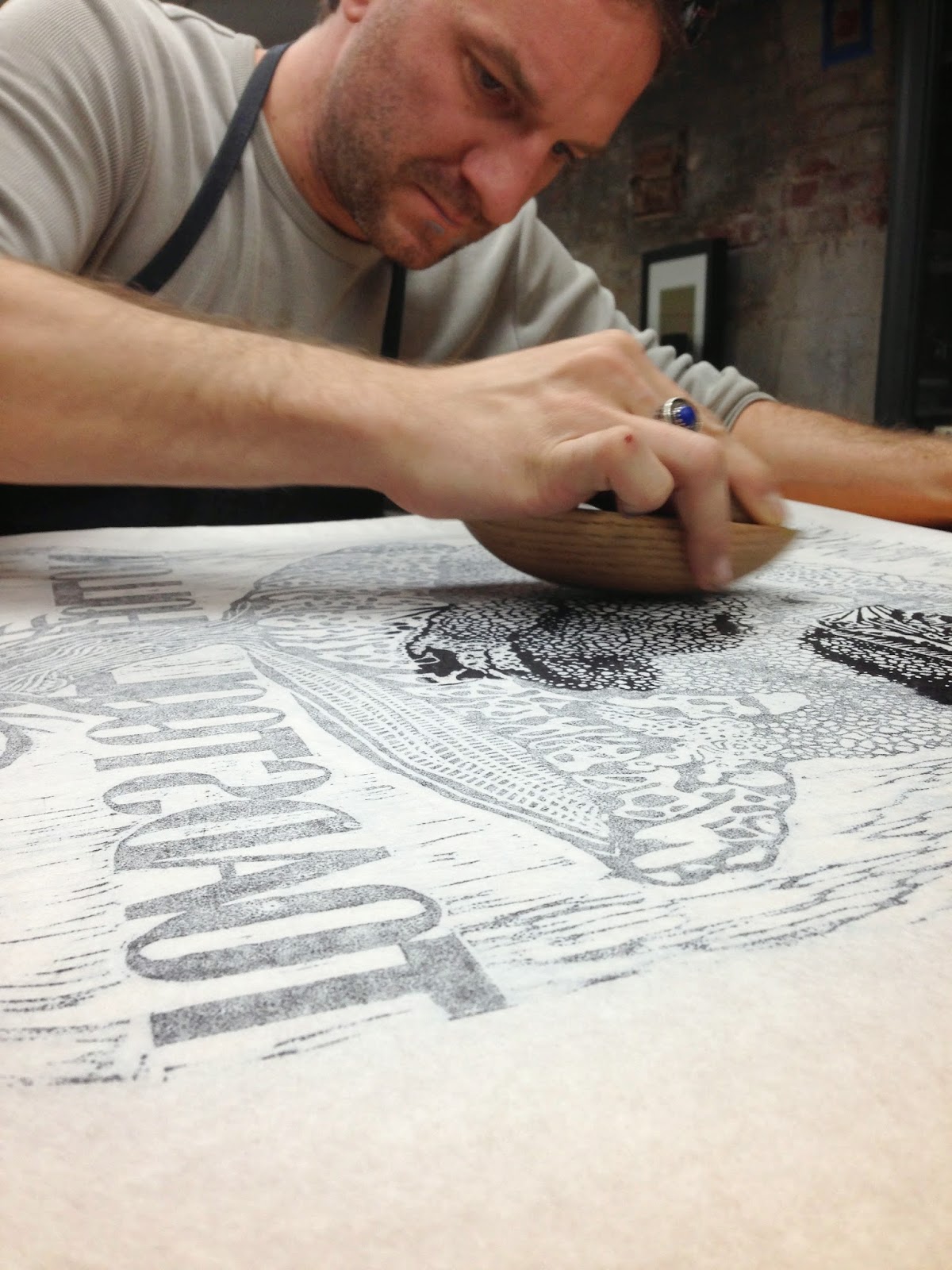
We hand burnish all of Mike's blocks. This can be accomplished using barens or the backs of spoons, but Mike showed up with these beautiful burnishing tools that he made with his father recently. They are very smooth solid wood in an egg shape, and they glide over the paper beautifully. They have a slight taper at one end so you can really get into small hard to print areas.

Pulling the 1st print.
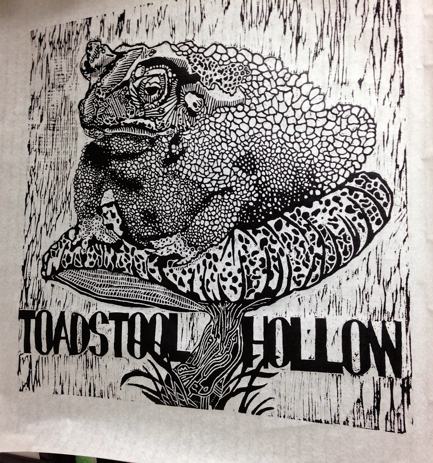
"Toadstool Hollow" print hanging to dry.

Mike brought one smaller block that fit on the Press bed, so we printed it using the etching press and then used hand burnishing to finish the prints up.

Printed.
A nice advantage to using Japanese paper and oil-based ink is that you can see the image through the back of the paper as you print it, either by hand or press. This is the printed block just before pulling the paper to reveal the print on the other side! The back of the paper is almost as crisp and dark as the front.

The Reveal!

Me operating the etching press.
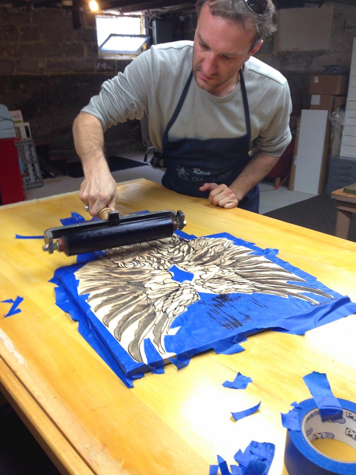
Before inking some of the blocks, we masked off the background around the image in order to not get any unwanted ink on the block and the print. It took a few minutes but the resulting print was clean and beautiful.

Inking right over the tape masking. The tape is pulled off just before the paper is placed on the block and burnished.

Hand Burnishing this Beast
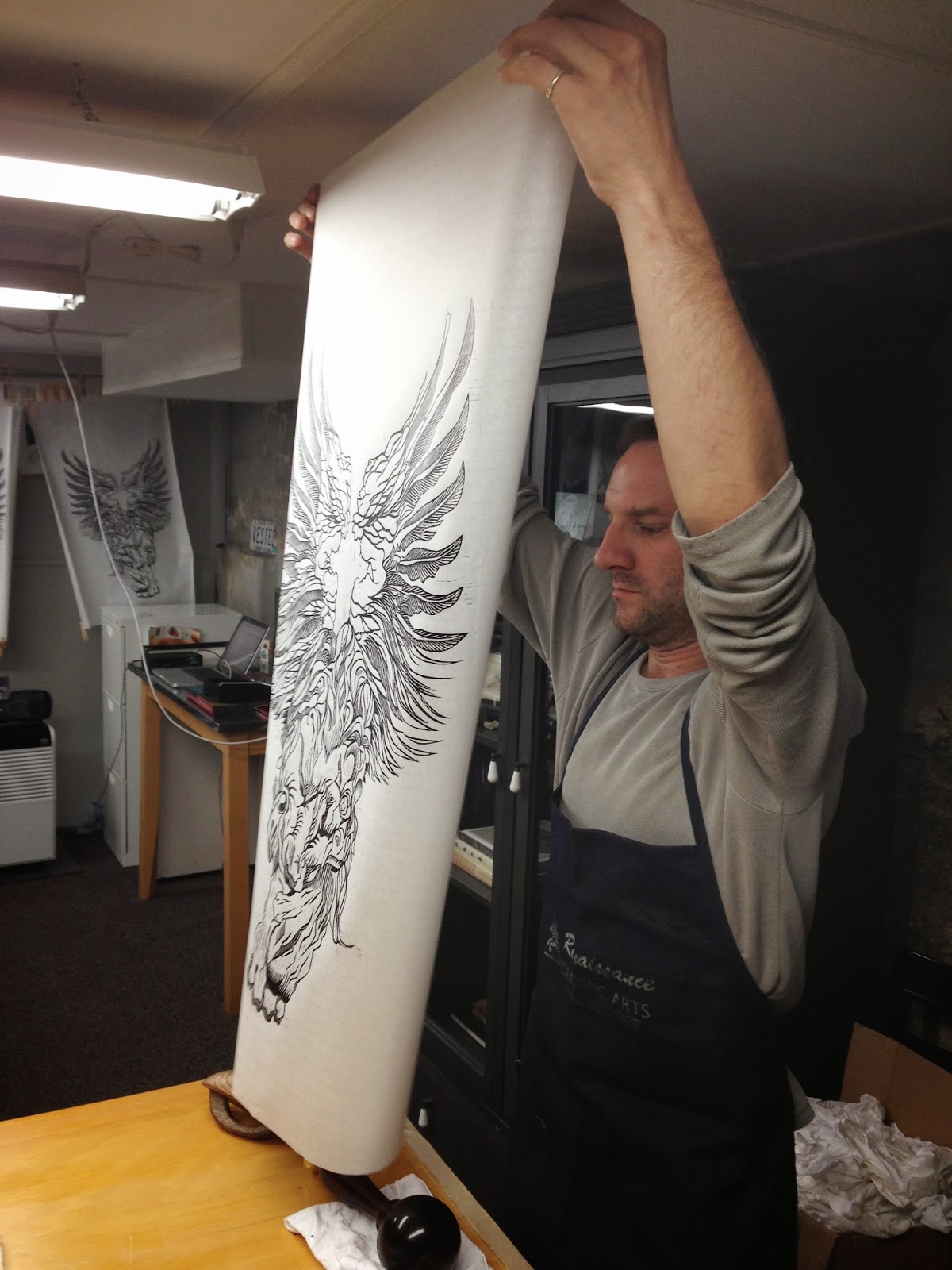
Pulling the Print
Mike's work is so large and graphic that it makes for pretty awesome and dramatic photographs!

While they were drying, we weighted the papers down with a few clothes pins on the bottom corners to prevent them from curling over and smudging the freshly printed images.

Looks like it's taking off!
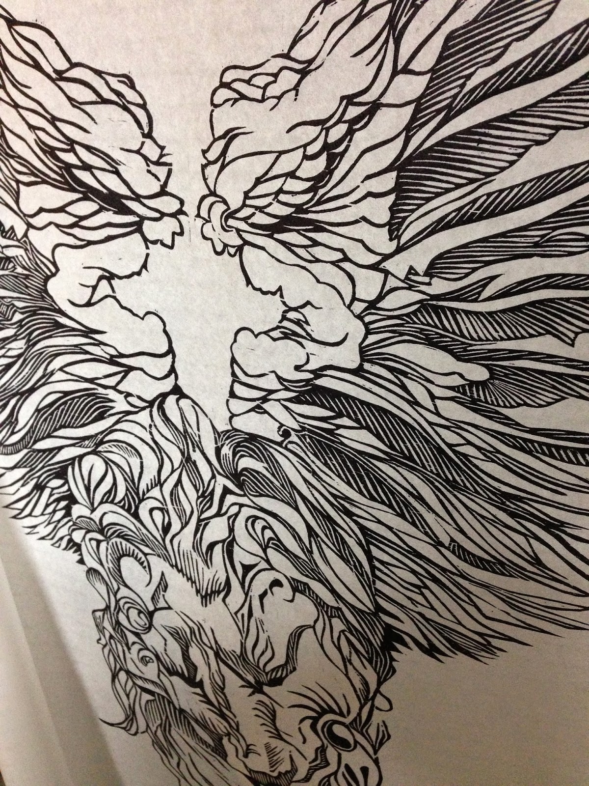
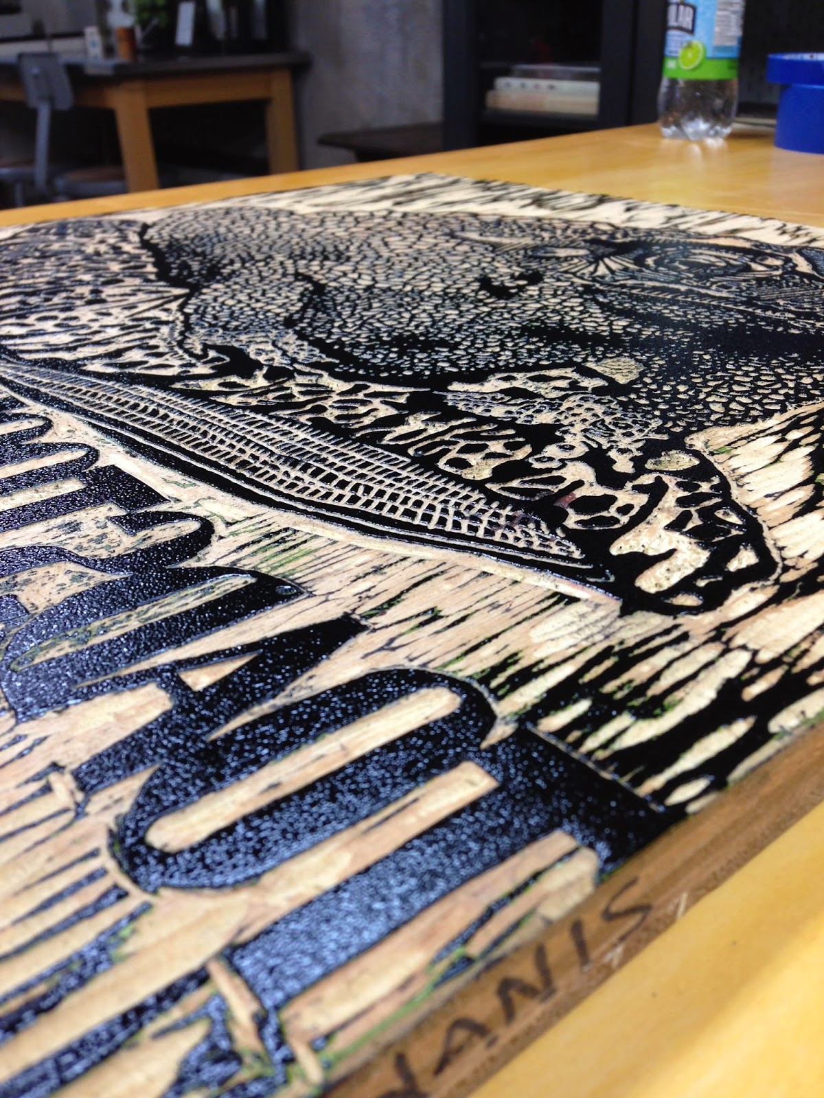
Crazy Details!

Hanging
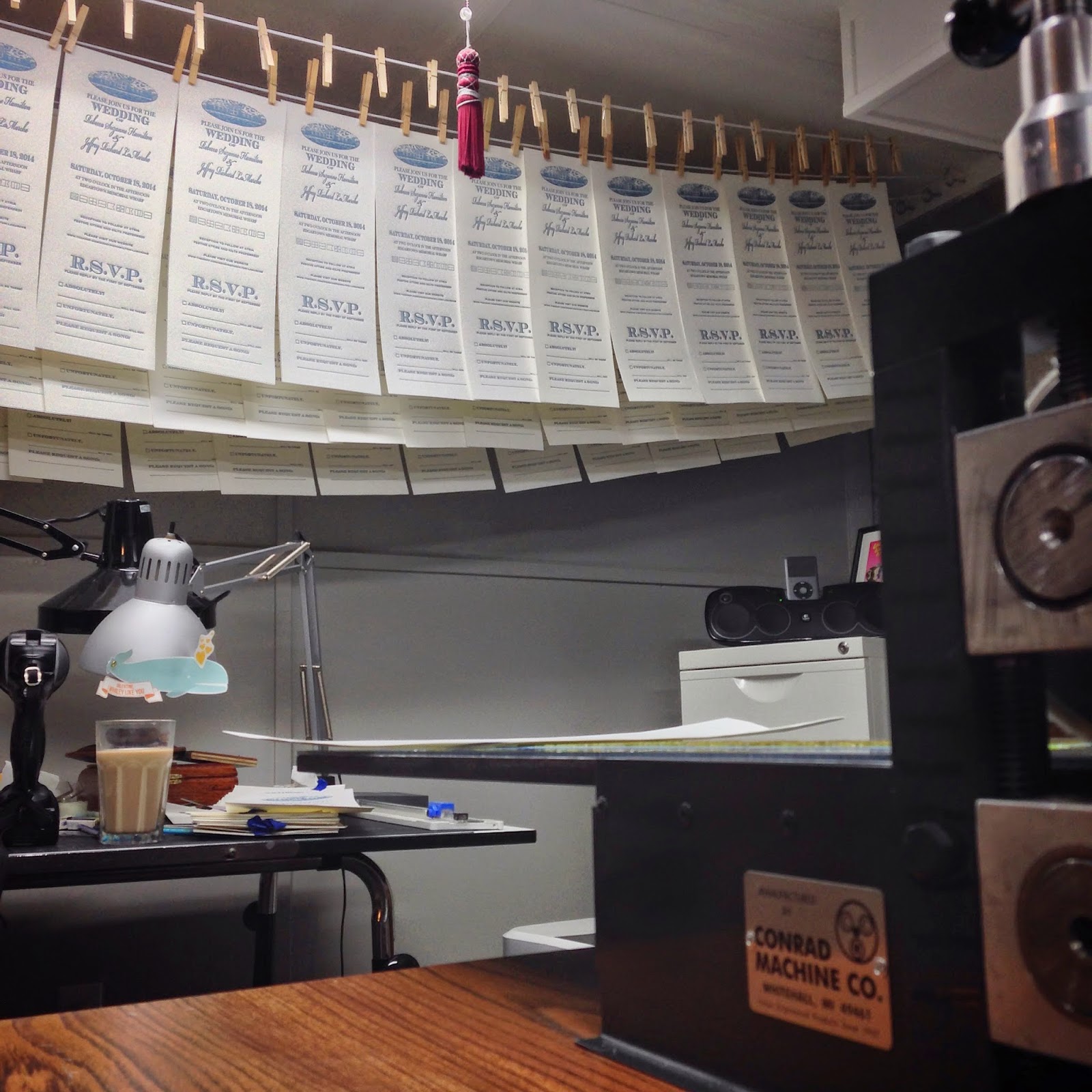
You can smell the drying ink outside! LOT of prints hanging...

Chewy makes a great shop dog.

A fun picture from Instagram. The reveal!


Detail of a woodblock.

By the final day the drying lines were full and the editions were printed!

COFFEE COFFEE COFFEE COFFEE

Spofford Press
Another killer week with Mike Kachanis. Looking forward to seeing what galleries these mammoth prints end up in!